Friday, 7 September 2012


Graphics Zippo project
This project was an open ended brief, we could focus on any area and any style to complete the poster, I originally aimed my design for 'the Beatles' poster, I changed the design to big companies and how they have a darker side to them, but kept the style of 'the Beatles' poster and the artist reference. I think the poster at the bottom was the most successful of the project and one of the most successful pieces of the second year of sixth form. This was because the poster reached all the aims I set out to achieve and the look and feel of the poster was the same as that of 'the Beatles' poster I originally set out to design. 
Graphics Penicillin project


This project was used to decorate the new Science block at my school, the brief was to create a poster on either great scientific contributions and discoveries , or medical discoveries. I chose to do a poster on penicillin and created several poster designs which related to the design brief, only three of the designs were printed off as I though the best showed my skill and relatively to the brief. I chose to print these posters as they related to the artist which was in the style of swiss style and Bauhaus. If I could change anything about the project it would have been to plan it in more depth and have a greater understanding of the subject of the poster.


 Graphics Frankenstein book project
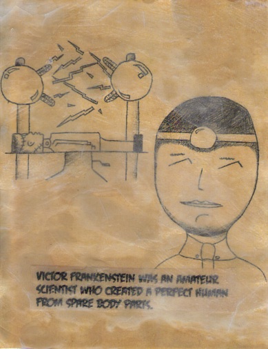

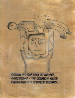
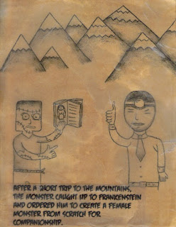


The project was based around creating a book from an existing book or fairy tale, I chose the story of Mary Shelley's Frankenstein. The Pages of the book were created on tea stained card, I then placed the illustrations and text on the card when it dried; I then covered the illustrated pages in wax to give them an aged look along with the tea stain. I found the project testing as I had to think of many more paths than I would have had to normally think about; for example, I had to think not only about the illustrations for the book, but the pages that the illustrations sat on, re-creating the story of Frankenstein within the word limit, the housing for the book including front and back covers and how the book would be held together (stables, bound or stuck together). With the amount of possibilities for the project it meant that I had to plan carefully each step of the project, including in-depth planning illustrations for each page, I also debated what style to draw the book in, either a light happy feel for a children's book, or a darker feel and more of an adult feel, I ended up with something in the middle of the two (although I wouldn't class it as a children's book). If I could change anything about the project it would be the way the book was bound, a larger time scale would have meant that I could have devoted more time at the end in finishing the book with a smarter way of connecting the pages together. 

 Sketches, doodles and old work
These designs have been completed in my own style, which I have personally developed over a number of years. I have styled many pieces around the linear style and is very much still an on-going personal project. The style started in less of a linear style and more fluid, it also depended more on doodles than shapes and shading. To the right is one of the most recent pieces completed in my own style, all of the pieces have been completed in biro; though recent experimentation with the style lead me to using colour compositions. 

The colour image two pictures below shows some of the first experimentation I have tried with my own personal style. The most recent version of my own style depends largely on the use of line and shapes (mostly geometric shapes) which help create a linear piece. Some of the pieces on the page comes from different stages of personal development, the piece at the bottom was one of the first creations in what later turned into a much more linear, blocky style as seen above.


 Photography project
For the photography project, we were told to take certain pictures in and around Bedford college, and then manipulate those images on photoshop. The photo's above and to the right were my favourite images, as the effects I gave the photos gave them an enhanced feel and look. From all of the pictures I took, only a couple of images went on to be photoshopped and a small number of those photos were effectively changed in photoshop.